Vimodi | Best mobile presentation discussion app
  • About
  • Features
  • Support
  • Use Cases
  • Blog
  • Press

Why the Bar Test is better than the Grandmother Test for your next Sales Pitch

6/14/2017

1 Comment

 
Picture
You might be familiar with the well-known “Grandmother Test” for determining how user-friendly and easy to understand an idea is. Sit down your grandmother, grandfather, or another family member who is completely unfamiliar with the subject area you’re working on, give them your best pitch, and see if they get the basic idea.

Clarity is a good start, but its not enough. The main point of the test is to make sure that people will understand what you’re talking about. But, your grandmother will usually try to support you and listen no matter what you have to say. Imagine giving the same talk to someone you just met in a bar—would they get bored and walk away?

IDEO Project Lead Nicole Kahn has a solution for transforming presentations into stories that captivate, and she calls it the “Bar Test.”

"Bars are friendly, social places, sure, but something really important happens when you’re at a bar,” explains Kahn. “You use really direct language. You make sure that what you’re saying is entertaining and engaging. You don’t quote tons of data. You don’t use overly corporate language — except maybe in air quotes.”

Before giving a presentation, Kahn and her IDEO colleagues run the Bar Test by giving their presentations to friends or co-workers who are unfamiliar with the subject area. "We grab a colleague …and buy them a beer or a coffee and spend 15 minutes to see if they understand the point of the presentation."

15 minutes could save you.....

Kahn recommends taking 15 minutes to see if they understand the point of the presentation. “We look for when they lean in, or when they look away or reach for their phone. We look for nods and ‘uh-huhs’—we look for what surprises and delights. That’s how we figure out what’s sticky and resonating.”

Why so short? Using only 15 minutes has a dual-pronged effect. First, it forces the story to be succinct. You must get to the point quickly, and also make the story pop. This is helpful, because it compels us to sift through what’s really important for conveying an idea. You might have 5 or 8 slides relating to an idea, but are they all really necessary for describing the heart of your idea?

15 minutes also keeps the investment low. That’s the beauty of the Bar test: it allows for a low-cost trial and error approach. If your first attempt doesn’t get a great response, that’s all right—spend your next 15-minute session using a new approach. The key is to be flexible, and don’t get stuck on one idea.

Passing the Bar test

Kahn stresses three essential strategies

Develop a cohesive “through-line”: What is the main takeaway? Make sure everything in your presentation builds up to and reinforces the underlying “big idea.”

Use compelling anecdotes: These little narratives are what bring your ideas to life and make them personal. Kahn suggests using anecdotes that “provide a tactile sense of experience, take your audience on a journey, and create drama.”

Incorporate personal reflection: Don’t be a robot. Think strategically about moments when you can use your own personal experiences and feelings. These can help cue your audience to react and feel what you want them to during the story.

More bar tricks

Use questions to engage others. Arthur Palac, formerly one of Miller Beers' top ranked salespeople, describes the importance of bolstering your message by asking reinforcing questions such as “Have you ever felt that before?” or “Has something like this ever happened to you?” According to Palac, "If you’ve been talking for over 20 minutes and you haven’t asked a single question of the audience, you’ve lost them."  

Use visuals. Visuals don’t just provide another level of information you can use to deliver your ideas, they actually change the dynamics of the entire presentation. Kahn explains, “When you have visuals on the screen and not a lot of words, you make people dependent on you as the presenter to know what’s going on. You have the authority in the room. The slides do not.” Text-filled slides usurp your power to control the room, craft your personal narrative, and hold the audience’s attention.

The next time you need to get buy-in for an idea or make a sales pitch to a customer give the Bar Test a try. No offense to grandma of course.

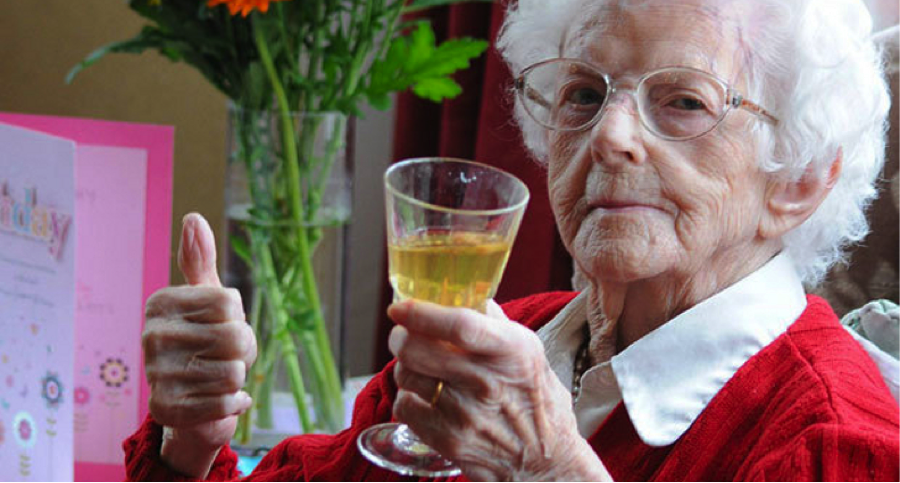
Photo* - Daily Star Sunday

At Vimodi, we are developing technology that helps users have a more engaging, responsive and effective visual discussions and dialogues. Vimodi enables visual mobile discussions for better engagement, motivation, and creativity in meetings and daily communication. Try Vimodi App.
1 Comment

Why Bullet Points and Build Effects Kill Communication

5/17/2017

0 Comments

 
Picture
You wouldn’t try to multitask while giving a talk, so why would you make your audience? Nancy Duarte explains in her book, HBR Guide to Persuasive Presentations, that using software to communicate is not an evil of itself. However, using uninspired bullet point lists and cluttered build effects can stop effective communication in its tracks. Applying a design-based approach to sharpen the focus of ideas and communicate ideas in context is the answer.

For each visual used, Duarte asks: “Can I immediately pick out the key piece of information on this slide?” Slides that are too busy with words or even unnecessary graphics detract from the critical message. Passing the test requires bringing a design focus to bear on building effective slides. Use restraint, and make sure that every additional element contributes directly to the critical information. For example, Duarte asks, “Does the audience need to see your logo on each slide to remember who you work for?” Even accents that may appear subtle and innocuous can be distracting and make it difficult for the audience to focus on what matters.
Duarte recommends applying these five basic design principles to each visual you create:

Flow: structure slides to direct the transition of people’s attention to what is most important

Contrast: juxtapose visual elements to draw striking comparisons that make your point even more obvious

White space: just as a well placed pause between words can speak volumes, managing blank space instead of trying to fill it can isolate and sharpen the focus of important points

Hierarchy: treat your slide like the page of a comic book—think about where the viewer’s attention will start and end to prioritize the information they receive

Unity: maintain harmony in text style, themes, and image types so that each slide feels like a different part of the same body

Using a design focus greatly increases the effectiveness of communication tools. Be frugal with each element you add to a slide so that you get the most out of every visual cue. 

Lessons from neurology have long highlighted the importance of visual processing. However, the less the viewer has to sift through to get to the critical information, the more effective the communication will be. 

Ideas need to be shown in context. As social media guru Gary Vaynerchuk once stated famously, “If content is king, context is god.” The value here is that communication is most effective when it builds on itself. Structure ideas so that they flow into each other in a way that tells a story—without context, numbers and graphics do not add anything on their own. 

*Photo - Effective Public Speaking Tips

At Vimodi, we are developing technology that helps users have a more engaging, responsive and effective visual discussions and dialogues. Vimodi enables visual mobile discussions for better engagement, motivation, and creativity in meetings and daily communication. Try Vimodi App.
0 Comments

Synesthetic Marketing: Could Your Presentation Taste Better?

5/16/2017

2 Comments

 
Picture
Is your sales and marketing pitch a red, a blue or is it a Bouba or a Kiki? Is it sweet enough?

'Please, gentlemen, a little bluer, if you please! - when Franz Liszt addressed his orchestra with these words, the musicians were stunned. How on earth do you play bluer? Liszt wasn’t the only composer who claimed to literally see the colors of music. Nikolai Rimsky-Korsakov believed C major was white, and the key of B major was a “gloomy dark blue with a steel shine”. Other people, meanwhile, are capable of seeing the colors of letters. Vladimir Nabokov said famously that to him, rainbow looked like this: KZSPYGV

Show people a star-like shape, ask if it’s called a “Bouba” or a “Kiki”, and 98% will choose the second answer. Some colors, shapes and sounds just match better in our brains, just like some smells fit particularly well with some colors or musical notes. Companies like Starbucks or Nestlé are already using such “crossmodal correspondences” to promote their products. Interactions between the senses can be used in many ways besides marketing - even to prepare better presentations. 

Synesthetes

Synesthetes, people for whom stimulating one sense causes experiences in another, are rather rare creatures - only one in twenty-three of us are like that. Some famous synesthetes include Pharrell Williams and Stevie Wonder. But nowadays scientists are discovering more and more proof that we all are a bit like Liszt and Nabokov: That all our senses interact with each other to create a fuller, more complex and fascinating world. We can all hear smells, taste colors, and smell music on some level.

"It just always stuck out in my mind, and I could always see it. I don't know if that makes sense, but I could always visualize what I was hearing... Yeah, it was always like weird colors." 
                                                                                   — From a Nightline interview with Pharrell

Think of the letter “A”. What color is it? And what about “B” and “C”? If you said red for “A”, blue for “B” and yellow for “C” you are like the majority of people. Does that mean you are as much of a synesthete as Vladimir Nabokov was? Not necessarily. Larry Marks, professor of epidemiology and psychology at Yale, differentiates between 'strong' synesthesia (like that of Liszt or Nabokov) and a ‘weak” synesthesia. When strong synesthetes see a sentence printed in black they perceive it as if a rainbow dropped on the page.

If you test strong synesthetes years later, they will still claim that the colour of a letter K is “huckleberry” (the way Nabokov saw it). Weak synesthetes - like the authors of this blog - have to think hard before they assign a colour to a letter or a day of a week. We are also more sloppy describing the hues. We don’t say that z is “thundercloud,” but simply “black”. What fascinates scientists, though, is that we all often agree in our synesthetic choices. Just consider: Which colour is heavier: red or yellow? Red is the most common answer. 

A German psychologist Wolfgang Köhler, constructed this particular experiment back in 1929. Köhler noticed that 95% of people choose “kiki” for the pointy shape, and 98% is convinced that the amoeba-like blob is called a “bouba”. What’s more, even illiterate people from Himba tribe living in a secluded part of northern Namibia agree on this. 

The Tchaikovsky taste of wine

Charles Spence, an experimental psychologist at the University of Oxford, dedicated his career to studying the surprising connections between our senses and how these connections could be used in practice. He found, for example, that people tend to match the smell of candied oranges with high notes of piano, and the aroma of musk with brass instruments. 

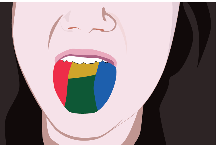
Our hearing is also associated with the sense of taste, touch and vision. Studies have long suggested that if we hear a sound that matches a flavour of a particular food, we perceive that food as yummier. For example, potato chips taste better if we can hear the crunching (next time you snack on chips put earplugs in your ears and see what happens). Other studies show that music can boost the taste of wine. In an experiment published recently in the British Journal of Psychology, people who tasted wine while Carmina Burana thundered from the speakers, found the drink heavy and powerful. Meanwhile, paring the same wine with calmer tones  from Tchaikovsky’s Nutcracker, made it taste more refined. And it’s not just wine and music. Charles Spence discovered, for example, that desserts appear sweeter when served on white plates. Similar research know as “Achilles’ Ear.” where study subjects listen to recordings of sounds, view images of shapes, or feel vibrations of a metal bar found that they were better at remembering things when they heard, felt and saw.

One of The Fat Duck’s innovative desserts

So can such findings be used in practice? Sure they can. To prove his theory, Spence is working with Heston Blumenthal, the famed chef of The Fat Duck restaurant in UK (considered one of the best in the world). In one such attempt, Blumenthal had created a bitter-sweet dessert, to which Spence helped fit two melodies: One that makes the dessert sweeter, another that accentuates the bitter tones of the dish. The customer then plays with the flavours by choosing which sounds he wants to spice up his dessert with.

How can music change the taste of wine or sweeten a dessert?  Likely there are several causes for this. First, there may be connections in our brains that make some crossmodal pairings appear “correct”. Second, it may be that we simply learn them through observing our surroundings - internalizing statistical regularities in the environment. Experience tells us, for example, that ripe fruits are more commonly red than green. Therefore, a red square painted on a sheet of paper will appear sweeter to us than a green one. Similarly, big objects are more likely to emit lower tones than small objects. Imagine you are a postman: If you hear low barking from behind one fence, and a shrill, high yapping from behind another, which garden would you be more willing to enter?

Synesthetic marketing

Humans, like things we find predictable. That’s why when multiple senses work together for example, if a color “fits” a sound, we enjoy the whole experience more and retain it for longer. And yes, you can use these findings in marketing. Spence believes that research on weak synesthesia can be applied in everything from creating advertising jingles to designing product packaging. Already, such companies as Starbucks, Roja Dove (perfume producer) or Courvoisier employ Spence to help them promote their products. Starbucks, for example, offers clients music which is supposed to boost the taste of coffee.  

Can weak synesthesia be also used in creating visual discussions? Sure it can. If you match colors, sounds and shapes well, they will complement each other and create a better, more enjoyable experience. So don’t write “sweet”, write “sweet”. As long as you don’t obsess too much what should your presentation smell like, it may be fun to give synesthetic marketing a try. For more ideas what fits what, check out research done in Spence’s lab. 

By Marta Zaraska @mzaraska, a freelance science writer in collaboration with Vimodi.

At Vimodi, we are developing technology that helps users have a more engaging, responsive and effective visual discussions and dialogues. Vimodi enables visual mobile discussions for better engagement, motivation, and creativity in meetings and daily communication. Try Vimodi App.
2 Comments

Do You Remember Your First Kiss?

4/2/2014

2 Comments

 
Picture

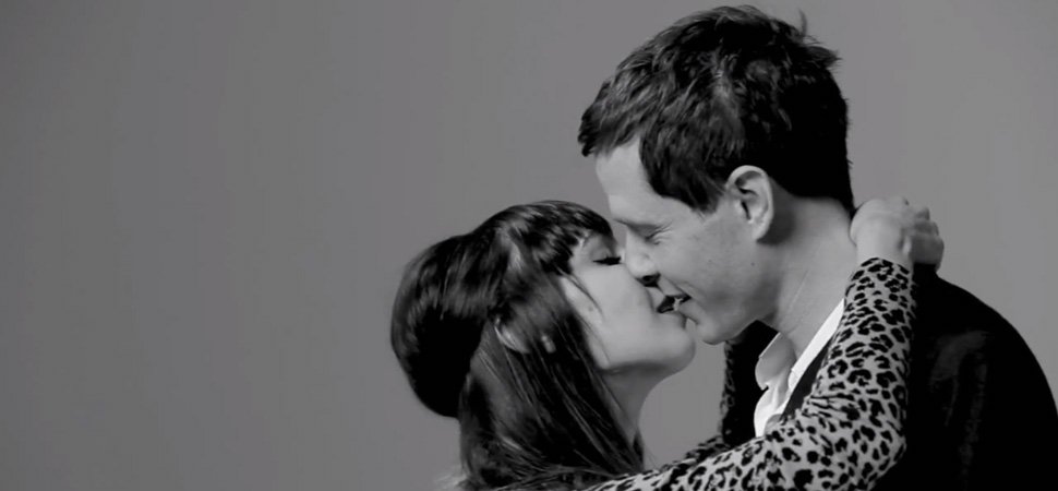
For most of us, undoubtedly the answer is yes. Just the mention of "your first kiss" brings a flood of memories, easily accessible and not faded by time. It is no surprise, then, that last month Tatia Pilieva’s video of complete strangers kissing for the first time became a viral sensation on YouTube. 

Why was your first kiss so memorable? 

Psychologist Haig Kouyoumdjian explains, "Think about your past school days of having to learn a set of new vocabulary words each week. Now, think back to the first kiss you had or your high school prom date. Most probably, you had to put forth great effort to remember the vocabulary words. In contrast, when you were actually having your first kiss or your prom date, I bet you weren’t trying to commit them to memory."

It’s all about the way that the brain is wired. Of all the sensory receptors in the brain, 70% are located in the eyes, and most of the sensory cortex is devoted to processing visual information. Kouyoumdjian puts it well when suggesting that our brain is primarily an image processor, not a word processor.

Achilles' Ear

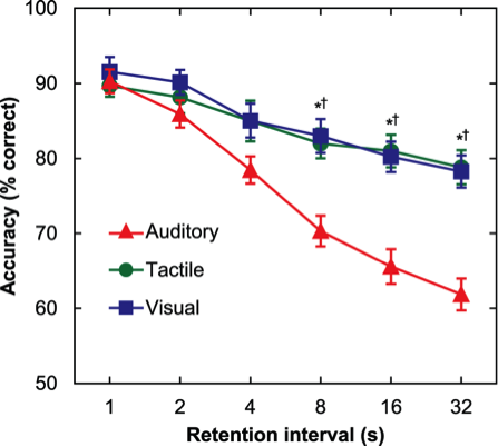
Researchers James Bigelow and Amy Poremba at the University of Iowa have conducted a new study dubbed, “Achilles’ Ear.” They had their study subjects listen to recordings of sounds, view images of shapes, or feel vibrations of a metal bar. Each subject was then presented with a second sound, image or vibration and asked to recall if it was the same or different. The authors discovered that subjects were much more likely to make mistakes if they were presented only with a sound rather then images and vibrations. Furthermore, their ability to remember got worse at a much faster rate for sounds than for images or vibrations. The conclusion? We are much better at remembering things when we hear, feel and see them.

Picture
There are huge implications for communication here. Molecular biologist John Medina makes the connection clear in his book, Brain Rules. He argues for the need to expand communication beyond just the words on page or the text on the slide. He puts it bluntly: “Professionals everywhere need to know about the incredible inefficiency of text-based information and the incredible effects of images. Burn your current PowerPoint presentations and make new ones.”

How can you translate this knowledge to improve your own communications? Here are three tips:

Visualize data: Present numbers in charts instead of text. To explain that your company's market share growth in Asia is double the growth in Europe, even a simple line graph or pie/bar chart will make a greater impact than text.

Translate concepts to images: Identify a memorable image that easily translates into words and sounds for each point you are trying to communicate. Have a dialog with your audience or customer to bring a sense of sound into your presentation.

Personalize with a hands-on experience: Let your audience "touch" your presentation. When presenting on a tablet, for example, don't be afraid to hand it over and let your audience navigate your presentation with you. 

The idea that we learn and remember more by seeing and doing has long been present in folk history. The Chinese philosopher Confucius is famously quoted as saying, "I hear and I forget. I see and I remember. I do and I understand." 

Confucius may not have been thinking of first kisses when he shared this wisdom, but the basic principles are the same. Images and interaction are the keys to better communication. 

Photo*-Tatia Pilieva via inc.com, PLOS ONE Journal


At Vimodi, we are developing technology that helps users have a more engaging, responsive and effective visual discussions and dialogues. Vimodi enables visual mobile discussions for better engagement, motivation, and creativity in meetings and daily communication. Try Vimodi App.
2 Comments
Forward>>

    Categories

    All
    Creativity
    Entrepreunership
    Funding
    Innovation
    Marketing
    Nonlinear
    PowerPoint
    Presentations
    Sales Interaction
    Visual Dialog

    Picture
Home    About    Features    Support    Use Cases    Blog    Press    Contact        
©2018 Vimodi | Presentation Discussion App for Meetings provided by tabloMedia Inc.